-


- Industries
-
Ordering
Food Grocery Home Services -
Delivery & Dispatch
Pick Up & Delivery Courier Delivery 3PL Delivery Dispatch -
Consultation
Telemedicine Fitness Legal Consultation -
Mobility
Taxi Software App Like Uber Car Rental -
Customer Engagement
Conversational support WhatsApp Marketing Customer Acquisition -
Sales Engagement
Inbound Sales Pipeline Management Sales Performance Analytics
Explore All Industries
-
-
Learn
- Partner
- Pricing


Blog JW Missing
Now fugu became more interesting and user-friendly
Fugu has not stopped updating its app with new features to set it apart from competitors. As a part of that now fugu brings a new web dashboard look that simplifies the usage of an existing feature. Typically this update includes visual improvements and significant changes to improve the overall experience.
Getting into detail…….
Till now to get into various workspaces we need to ho through the workspace names, but now to make it simple an alternative is included in the app.
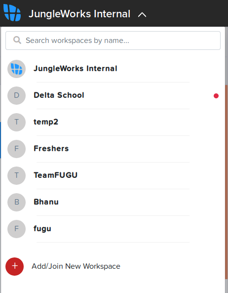
In this new dashboard look, all the workspaces are shown as icons on the left side. So, that we can switch among the workspaces smoothly. And also have a simple drag and drop option that you can change the workspace preferences, means as per your requirement you can drag most active workspaces to top of the list.
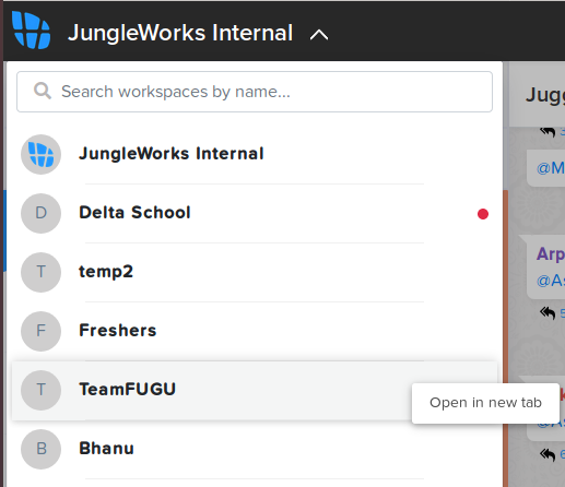
By right-clicking on the workspace icon on the left side, you have an option to open the workspace in a new tab that you can work with multiple workspaces simultaneously.
Our team is already enjoying this new dashboard look. Creating a new space that best suits your organization means serving the needs of your staff efficiently. Today we are happy to share it with you. It’s time for you to try fugu. Feel free to share your thoughts.
If you enjoyed reading this, we’re sure you will also love checking out what we have in store on our Youtube channel. You can also head to our home page for more info!
Subscribe to stay ahead with the latest updates and entrepreneurial insights!
Share this article:


Subscribe to our newsletter
Get access to the latest industry & product insights.
You may be interested in these articles
-
Jungleworks9th February 2026
How Last-Mile Delivery Impacts Customer Experience & RetentionIn the age of instant gratification and on-demand services, last-mile delivery.. [..]Read story
-
Jungleworks4th February 2026
Delivery Management Software: A Complete Buyer’s Guide for 2026In today's fast-paced digital economy, efficient delivery operations can make.. [..]Read story
-
Jungleworks2nd February 2026
Delivery Software for Dark Stores & Quick Commerce: The Complete Guide for 2026The retail landscape has fundamentally transformed. With consumers demanding.. [..]Read story
-
Jungleworks27th January 2026
Last Mile Delivery KPIs Every Business Must TrackThe last mile of delivery - the final step in getting products from a.. [..]Read story